Pantone Tarts
May 28, 2012 § Leave a comment
I wish I thought of this! Pantone Tarts by French food designer Emilie de Griottes
Building Deconstruction
February 15, 2012 § 2 Comments
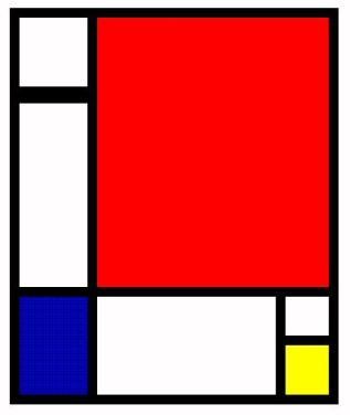
Playtime (/study time…) on illustrator (basically trying to get to grips with it). Keeping in mind a focus on colour in architecture and using grids within graphic design and the wider context of other design practices. Here is my small (took me ages!) effort.
The building is the Sports and Leisure Centre in Saint-Cloud by KOZ Architectes. Next up somewhere closer to home… Peckham Library.
SaTC presentation
February 14, 2012 § Leave a comment
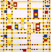
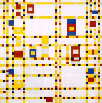
Right I’m finally getting around to doing some posts on our current project Structure and the City. The week before in class we had to do a 60 sec presentation using 3 slides (20 secs per slide) taken from our Research Trip to the Tate Modern & City Hall. I actually found this presentation to be really useful as my head was exploding with ideas / non-ideas / lines / dots… and if anything I found I had too much to say, so editing it down to one train of thought proved exceedingly useful. So following the train of thought from the Research Trip and seeing Tacita Dean’s exhibition (post below) I was reminded of Mondrian and subsequently found his painting of Broadway, Boogie Woogie.
The simple use of primary colours on a grid (a static structure) yet it conveyed a lot of movement. It then got me thinking in terms of London; the tube map. A design we’re all so familiar with and a means of getting from A to B implying movement within the City. 
My head swarming with lines, dots, squares, grids… I found myself on a RED London bus one evening looking at YELLOW lines, BLUE squares and traveling from A to B.
Reading the project brief and literally taking it to be structure as in architectural I thought about how I could convey this train of thought to the designs. Immediately Richard Rogers popped into my head and so I went to 88 Wood Street to take some photos of the building exterior with his use of yellow, red and blue for the vents and pipes. Which I incidentally thought looked like the tube maps’ Central & Piccidilly lines coming out of the ground and the circle line still going.
So to summarise – KEY WORDS: Primary Colours, Movement, Architecture
Tacita Dean at Tate Modern & Mondrian
February 1, 2012 § 1 Comment
Some photos I took at the Tate Modern Unilever Series of Tacita Dean’s FILM, which is an 11-minute silent 35mm film projected onto a gigantic white monolith standing 13 metres tall at the end of a darkened Turbine Hall. I like how there is a single person sitting in front of the screen to show the scale. As you can see the image is sometimes of the back wall of the Turbine Hall itself, but with its gridded form coloured in red, yellow and blue so it resembles a Mondrian.
 Mondrian is known for his grid-based paintings of perpendicular lines in primary colors.
A big fan of American Jazz Broadway Boogie Woogie depicts the city grid with dots for movement of traffic, blinking lights and the rhythm of jazz.
Homage to the Square
January 26, 2012 § Leave a comment
Josef Albers (1888–1976) Oil on Masonite
Producing more than a thousand works over a period of 25 years, Homage to the Square was based on a mathematically determined format of several squares, which appear to be overlapping or nested within one another. He used this geometric abstraction as a template for exploring the subjective experience of color—the effects that adjacent colors have on one another. Personally I love his use of colour and how they are indeed interacting. Looking closely the edges of the squares aren’t perfectly straight with the colours migrating across (although not overlapping) creating movement in the pieces. In choosing colours that would perform with one another, he creates the illusion of them either moving forward or receding backwards.
Merely a test post
January 17, 2012 § 2 Comments


