
Pantone Tarts
May 28, 2012 § Leave a comment

I wish I thought of this! Pantone Tarts by French food designer Emilie de Griottes
SaTC Quote Spreads
April 17, 2012 § 1 Comment
I’ve redone the chapter break spreads. Originally they just had the quote with a single colour digitally produced. While I liked the idea of just filling a page with one colour, I felt that they were too flat and I could do more with the pages. I’ve used photos relating to each colour to try and lift them out and have some texture. I’ve also redone the quotes, as I think I managed to break every typographic rule in the prototype :)
BLUE: Lead into chapter about Peckham Library.

RED: 88 Wood Street chapter

Yellow: Central St Giles

Lego does colour block
March 20, 2012 § Leave a comment

These are well cool. A new print campaign for lego, that’s been created by German ad agency Jung von Matt.

The campaign features minimalist interpretations of cartoon / kids show characters.
 This is my favourite. Maybe it’s the stripey tops.

So simple, yet recognisable and effective.
SaTC contents page
March 12, 2012 § 2 Comments


From my SaTC book – contents page: CAPS or smallcase… still thinking about it.

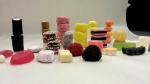
Sweets & the City
March 9, 2012 § Leave a comment
Inspired by the SaTC project, here’s today’s workshop on Information Design – sweets arranged in height.
-

- sweetscape
-

- aerial shot

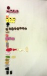
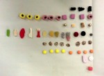
We also arranged by colour, shape and texture / flavour.
Framed at the Tate
February 28, 2012 § Leave a comment


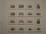


Catching up on some work I’d planned to do dating back to the start of the visual grammar workshops. When I was in the Tate Modern I took a few photos of some of the smaller art pieces arranged in frames with the notion of reproducing them as a visual grammar exercise. Finally got around to doing some.
